 These are the step by step instructions for assembling my chair. I chose to present them as static photos as that is the format in which they would be distributed if in production. The step by step instructions have 9 steps and the chair is fairly easy to assemble.
Thursday, June 4, 2009
Instructions
 These are the step by step instructions for assembling my chair. I chose to present them as static photos as that is the format in which they would be distributed if in production. The step by step instructions have 9 steps and the chair is fairly easy to assemble.
Final
 This is my final model. I am fairly happy with how it turned out however im disappointed that the side tabs didn't stay in firmly enough. I found, when making my model that the more you put it together and pull it apart, the more it deteriorates. That is one consideration when working in a medium such as cardboard. I have left the chair in its final form in order not to wear it down further. I am happy that i ended up achieving the curves and that they are very neat adn quite subtle. I like the complexity the side elevations show as well. The proportions seem to work well for the purpose the chair will serve- to 'perch'. Below are some more images as well as a 1:1 model timeline of the four finished models i made. I made another model from xanita that features in the earlier posts but is not featued in the timeline as I wanted to show more refined finishes from the two cardboards. The first xanita mock up that i left out was more of a canvas for the next two so is not as highly refined.
Branding
 For the branding of my chair I downloaded the SaloneSatellite logo and while keeping proportions the same, adjusted the size to fit my chair. I wanted simple graphics on the chair as the chair itself is quite a complex shape. I practised spraying the branding on by using a 160gsm sheet of paper which i cut the stencil from. I realised that this wouldn't be able to take too many sprayings so I got a stencil laser cut out of acrylic. I did a couple of test sprays and then I masked off my model with newspaper and used the stencil to spray on the branding. I positioned the branding along a fold line up the side of the chair which i think emphasises the complex form of the chair and provides a suitble, bold yet basic branding. It is relevant to the event it sits in and is visible from pretty much all angles as it runs up both sides of the chair. I put the branding on my second model first before putting on my third and final model.
Flat patterns
 This is the back or inside of the chair with all the appropriate cutc identified. I only used curve cuts by removing the top layer and direct slices that go 9mm deep.
This is the flat pattern with dimensions. This demonstrates an economic use of material as it is just less than 1830 wide and exactly 1220 tall. The thickness is 10mm.
In context
 This is my chair in context. The chairs would be assembled at the entrance of the Salone Satellite exhibition where a projector screen would be up showcasing all the entrants work and where they are in the event and how to get to their stall. This area, at the front, would be a waiting area and a breif seating area. This would mean that no one would be relaxing too much in the chair, but more, 'perching' for 5-10 mins. I curved the seat in order to create a slightly more comfortable chair to sit in and the back rest is short as to let the user knwo the chair is not so much for relaxing as it is 'perching' or waiting.
Model making
 This is my final design with branding.
 These are my second and third models. They both have branding on them.

This was my first model on which I found the problems i had to fix. the main problems I found were the side tabs that didn't properly tuck in. In this image, you can see i have added on a tab with masking tape in order to see if an attached tab would hold the side tabs in further. It proved to work, however, they still posed a slight problem in the second and third models. The second model I did, the holes in which these tabs push into were slightly off the right angle and were slightly too long. This let them slide back out slightly so I redid the model a third time making sure to get the holes on the side the right angle and size. I acheived this, however, they stil marginally slid out so if i was to make another model I would have the two tabs interlock within the shell of the chair so that they pulled back against each other and you wouldn't be able to see it from looking at the chair. Unfortunately this was an expensive process and also time consuming but with more time i would fix the problem this way.
Tuesday, June 2, 2009
Xanita board 1st attempt
 This was my first attempt at the 1:1 mock up out of xanita board. I used the same method of achieving the front and seat curves as i did when i made the mock up of that area and it worked really well. I achieved the subtle curvature without it tearing. I came across another problem though as I found that the xanita board was a lot stronger than the other cardboard I had been working with and the xanita board didnt want to stay in place as much, but recover to its natural straight form. This caused a problem with the side tab which didn't stay folded in against the side. I overcame this problem by adding a small tab which slotted into the side to hold it in place. This, however, meant that I only had the one final attempt to get it right. At this stage, I will try my best to locate where the hole should be so the tab can slot in neatly.
 These were my attempts to fix the tearing problems i had at the intersection of the curved surfaces. The first attempt used v cuts which were 20mm wide (10mm each side). This tore the most and looking at where the tears occurred, I thought that maybe widening the v cut at these points may help. The secodn attempt demonstrates this and although it was slightly better, there was still significant tearing. I then used a curved edge where I removed only the top layer and I realised by using a Vcut, it left only the top layer of the xanita board which, by itself, wasn't very strong and tore. By removing only the top layer, it still left the bulk of the material so there was more material to withold its shape. The curved edges worked well, making it look neat as well as not tearing. I also had to take out some material at the corner points where these faces met to eliminate and tears beginning there from all the bending. I like the graduated bending as it keeps in theme with the straight lines of the rest of the chair.
problems/concerns

My major concern for my chair when making it out of xanita was the front edge where the two curved surfaces met. Because of the angles in which they are folded, there are areas which want to peel away from the top surface/skin of the board which results in tearing. I noticed slight tearing in my 1:1 model using the thinner card. This made me think that I needed to do a mock up of the affected areas in xanita.
Monday, May 25, 2009
Saturday, May 23, 2009
Friday, May 22, 2009
1:1 model #2
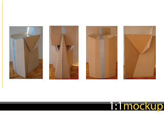 This is my refined model. I reduced the height of the backrest to accomodate to the size of the sheet of xanita which worked out well actually as I don’t want the back rest to be too inviting so that people want to lean back in the chair as it is not one for relaxation. I also reduced the amount of material at the back which i think works quite nicely too as you get some nice shapes coming through from the side tabs. I have maintained the 3 step curve for the seat etc as I think it ties in well with the rest of the geometric folds of the chair however I will look further into how to achieve a curve without tearing the material. I cut small holes from the corners where the seat, front and side panels meet to reduce the stress but there was still some tearing. The side tab measurements are right as they tuck in nicely one it is all locke together.
I also need to lock the back together to restrict any movement sideways. I will do this discretely inside the unit so that it is not visible. Overall, I am happy with the shape, proportions and form.
Friday, May 15, 2009
1:1 model
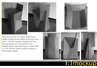 This is my first 1:1 mock up of my chair. I think that overall the shapes and forms I have achieved are quite interesting and I made sure that I considered the chair at all angles you look at it. I managed to get the tabs that came off the side of the seat surface to tuck in nicely to follow the folds on the side supporting surfaces as well as tuck in neatly behind to lock it all together. I was able to sit on this chair will some precaution as I didnt want it to break before I took it into class but it was reassuring to know that it held the majority of my weight even though it was made from a thinner, weaker cardboard than the xanita board will be.
I did come across a couple of problems when making this chair and that was the curve at the front. Because it is visible, I will need to work to refine it in order to allow it to bend without tearing. I also need to reduce either the width or height of the flat pattern as it didnt fit properly onto the size that our final xanita board will be. To do this, I will take the supporting surfaces down about 20mm and then reduce the size of the back rest and and the material that tucks down the back.
Tuesday, May 12, 2009
Concept development and refinement

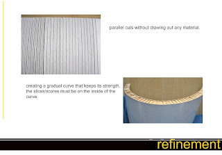
Here I was refining my concept and looking at the ways in which to develop it further in terms of the shape and ways of achieving the curve. I first tried to mark out where i would need to make the cuts on ome of my existing pasteboard models. I then tried it multiple times in xanita board varying the width of the gap made between the front surface and the seat. I had trouble with this section because where the two curved faces met, the thin layer of card tore.
I experimented with just having scores along the underside of the seat as well as actually removing material. I also looked at having less of a gradual curve and making it curve using just three flat surfaces at different angles. I like this idea as it created a more enticing seat yet still stuck to the 'truth to material' idea.
As I would like to conceal all cuts made to achieve folds by having them all on the interior of the chair, I focused on trying to achieve bends through cutting only the undersides of all the surface. I may have to consider looking at cutting the visible side of the seat to achieve a good curve.
Monday, May 4, 2009
Concept Progression
Tuesday, April 21, 2009
Concept three
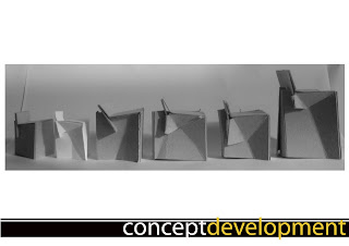
 This was my third concept with which i experimented with an interlocking system at the top. The three pieces of xanita baord intertwine with each other to lock together. Each leg will have a locking system to hold them together as well. Im unsure whether the legs will hold locked when pressure is applied to the seat- this may need an additonal brace at the base of it.
Concept two
 For this concept, my inspiration came from my second esquisse where we had to hold 100kg. I looked to what had worked for me in that circumstance and applied it here. The interlocking base provides strength as well as a nice neat zig zagged bottom. The puzzle-like shape can be altered- i just showed that to demonstrate the modular function it can take on.
Concept one

Saturday, April 18, 2009
concepts


concepts


 These are some sketches for a range of pieces of different types. There is a squat stool, another stool with a slight backrest that could be classified as a 'perching' stool and also a proper more traditional chair. I was playing around with simply slotting the pieces back into itself as I am aiming to use only the one piece of material. The slanted bottom panels add more support as they are placed under where the person would sit.
concepts

Humans and seating
 This is a board i put together to look at the ways different poeple interact with furniture. I looked mostly at squat stools which I plan to design for. I think that short stools are more aesthetic when made from cardboard and can have some quirky yet neat designs. This analysis gives me an idea of how poeple sit on stools and whether a small backrest is needed or the height in comparison to the person ie. how bent thier legs are when sitting down. Also the posture that people take when sitting on stools could give some insight into the balance that is needed ie. how high is it in comparison to the diameter/length/width of the top of the stool.
Effective/economical use of material

Friday, April 17, 2009
conclusion: Salone satellite Milan

I have chosen to set up an area at the entrance of the pavillions that the Salone Satellite exhibition is in at the Milan fairgrounds. The area will serve as a meeting point, resting area and waiting area for perhaps those waiting for others still looking around. The seating will not serve as a place for relaxation so much as the event wants visitors looking around rather than sitting. The graphics will tie in with the theme of the event and become a focal point as visitors walk in. There will be a screen or blank wall on which a projector will show images or short clips of the various entrant in the event.
There could also perhaps be a bench along the front wall that people can use to write details, sketch or fill out forms if there are any that relate to feedback or anything. The stools will provide seating for this as well.
This is a quote from a Belgian group that exhibited in the Salon Satellite event last year on ecodesign; "Ecodesign is very much an implicit parameter and not a passing fad. It is a state of mind, not a label. The choice of a material, the innovativeness of the solutions, the size of the object and the finish have strong, original, poetic connotations. Creators that combine quality of life, respect for the environment and for the user in their creations."
Thursday, April 16, 2009
Tuesday, April 7, 2009
One single rectangular piece of cardboard
http://www.youtube.com/watch?v=vxD9UuiSAFo&NR=1
This is another really cool design that expands out to become different types of seating from a loung like chair to bed-like seating. Very cool idea.
http://www.youtube.com/watch?v=EKN7J3hLp7I
Another very clever collapsible stool
http://www.youtube.com/watch?v=KkJBIwhQhoA&feature=related
Esquisse 4: Xanita board

Tuesday, March 31, 2009
ESQUISSE 3: 3D Translation

For my first attempts, I made 3 separate models from 80gsm paper. Model One used strips of paper of increasing size folded and pinned together to form the flower. Model Two used diamond shapes of varying size slotted together to create a curved form making up the petals of the flower. Model Three was a origami model that i made which ended up with varied sized petals.
 My final models followed the Fibonacci sequence (1, 3, 5, 8, 13, 21...) and appear more proportionally correct. The first model followed the same method of Model One in my first attempts however this time i made the smallest petals 10mm wide and 30mm long, the second layer of petals were 30mm wide and 50mm long and so on. The second model used diamonds of decending size to create the shape of the petals. They, too, used the numbers of the Fibonacci rule to guarentee more correct proportions.
Saturday, March 28, 2009
Thursday, March 26, 2009
Leaf folded from paper


